What a Sidenote Actually Is
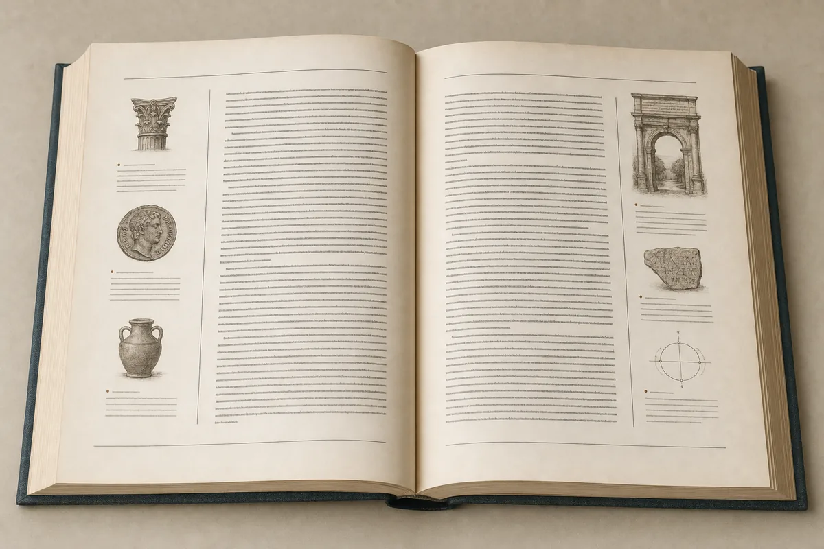
A sidenote is a note set in the outer margin of a page, level with the passage it annotates, rather than collected at the foot of the page or the end of the document. The reader takes it in without moving their eye off the line they were reading, which is the entire point of the form.
The distinction matters because on the web a footnote is not really a footnote. HTML has no page, so a note marked as a footnote lands at the bottom of the document — functionally an endnote, however it was labelled in the manuscript. The reader clicks away, loses their place, and clicks back. Marginalia predate Gutenberg's press, and readers were writing in margins long before any printer set them there deliberately, so the sidenote is closer to the older habit than the footnote is.
Why Footnotes Break Down on the Web
Footnotes fail online because the web has no fixed page boundary to anchor them to. In print, a footnote is visible within a single eye movement; the reader glances down and returns. Strip the page away and that relationship collapses — every footnote becomes an endnote, sitting hundreds of scroll-pixels from its marker.
The cost is measurable in reader behaviour rather than in typography. Each jump to a note and back imposes a context switch, and the reader has to reconstruct where they were in the sentence. Sidenotes decrease that cognitive load by removing the jump entirely: the note is already on screen, already aligned with its reference. For scholarly prose, where a single paragraph may carry three or four citations, the difference compounds across a whole article.
The Renaissance Precedent for Margin Notes
Margin notes are not a web invention but a recovery of Renaissance book practice. In Renaissance books, notes were permitted to move around in the margins so they could sit exactly where they were needed and enrich the page rather than interrupt it. The margin was working space, not dead space.
Robert Bringhurst's The Elements of Typographic Style holds its own notes in the side margins for the same reason, putting the information near and alongside the reference in the text. That lineage is worth knowing because it reframes what a web sidenote is doing. It is not a clever CSS trick looking for a use; it is a print convention that the web briefly lost when early HTML gave designers no margin to work with, and that returned once layout tools made a genuine outer column practical again.
How Sidenotes Are Built in CSS
A sidenote in CSS is produced by reserving an outer column and positioning the note into it, rather than by any dedicated HTML element. The common approaches all solve the same problem — get the note out of the text flow without losing its vertical alignment to the marker.
- A wide container with the main text constrained to an inner column, notes absolutely positioned into the remainder
- CSS grid with a named margin track that notes are placed into directly
- Float-based notes, the oldest approach, still common because it degrades predictably
- A checkbox or
<details>toggle that reveals the note inline when there is no margin available
Working demonstrations of each variant, including superscripted CSS markers and pop-up note behaviour, are collected at Archiva, alongside the older DHTML implementations that preceded the CSS ones. Which approach suits a given publication depends less on elegance than on whether the notes need to be selectable, printable and reachable by a screen reader in document order.
Numbered Markers Against Unnumbered Notes
Numbering is optional for sidenotes in a way it never is for footnotes. Sidenotes may not need reference numbers or symbols at all, provided the note sits near enough to its context within the text block for the association to be obvious. The proximity does the work the number would otherwise do.
Practice splits on this. Edward Tufte uses numbers for margin notes throughout his books, and most scholarly publishers follow suit because citation numbers carry meaning beyond navigation — they are referenced in indexes, in errata, and in other people's citations of the work. An unnumbered sidenote is fine for an aside or a gloss. A numbered one is close to mandatory when the note is a source citation that another scholar may need to point at precisely.
What Happens on a Narrow Screen
Sidenotes have no margin to occupy below roughly 1,000 pixels of viewport width, which is where most implementations either fall back or fall over. The honest options are to inline the note directly after its paragraph, to collapse it behind a tap target, or to push it to the end of the section.
Inlining is the most robust because it preserves reading order for screen readers and for anyone printing the page. Collapsing behind a toggle keeps the main text uninterrupted but hides content from find-in-page in some browsers, which matters more in scholarly work than in general writing. The decision is a publishing policy rather than a styling preference, and it is worth settling before a journal commits a whole run of articles to a template.
Where Sidenotes Still Break Down
Sidenotes fail predictably in three places: long notes, dense clusters of markers, and any layout where figures already occupy the margin. A note running to a full paragraph will overflow its slot and collide with the next note down, and the usual fixes — shrinking the type, allowing overlap, silently truncating — all degrade the scholarship.
Clusters are the harder problem. A paragraph carrying five citations in three lines has nowhere to put five aligned notes, because the vertical space simply does not exist beside those lines. Publications that hit this regularly tend to adopt a hybrid: short glosses as sidenotes, full source citations collected conventionally at the end. That is less pure than an all-sidenote design and considerably more usable.
Accessibility and Reading Order
A sidenote must remain in sensible document order for a screen reader regardless of where CSS places it visually. The failure mode is a note positioned into the margin by absolute positioning while sitting, in the underlying HTML, several hundred elements away from the passage it annotates.
The reliable pattern is to keep the note immediately adjacent to its marker in the source and move it visually with CSS, never to reorder the source for layout convenience. Markers themselves need to be more than a superscript numeral — a bare <sup>1</sup> announces as "one" with no indication that it is a reference. Wrapping the marker in a link with a descriptive label costs nothing and makes the apparatus navigable rather than decorative.
Sidenotes in Journal Production Workflows
Most scholarly production pipelines were built around footnotes, and that assumption is baked into the tooling well below the presentation layer. Manuscripts arrive as Word documents with native footnote fields, get converted to JATS or a similar XML, and emerge with notes marked up as end-of-document content because that is what the schema expects.
Converting to sidenotes is therefore a conversion problem rather than a stylesheet problem. The XML retains a footnote structure; the web renderer reinterprets it as marginal. That indirection is actually an advantage, because the same source can produce a genuine footnote in the PDF and a sidenote on the web without the author maintaining two versions. Publications that try to author sidenotes directly in the manuscript usually discover their PDF pipeline no longer works.
What Changes for the Reader
The measurable effect of sidenotes is on how much of the apparatus a reader actually consumes. Notes that require a click are largely unread; notes already on screen get read in passing, which changes what an author can reasonably put in them. Glosses, caveats and pointers to further reading become useful again rather than being effectively invisible.
That shifts editorial practice as much as design practice. An author writing for a sidenote layout can move qualifying material out of the main sentence and into the margin, keeping the argument clean without burying the caveat. The main text gets shorter and more direct, and the hedging that clogs academic prose has somewhere legitimate to live. It is a small typographic decision with a surprisingly large effect on how the prose above it gets written.